Department of Frequency – ARFM
Brand Identity Design Office of Radio Frequency Department – Ministry of Information and Communication
Total project
In the early 90s of the twentieth century, radio communication in the world in general and in Vietnam in particular had a very strong development. The fact that the second generation cellular mobile communication system has been widely developed in the world and started to be used in Vietnam has raised many new problems in radio frequency management. The need for a state management organization on radio frequencies large enough and modern To ensure effective use of frequencies has become urgent. Responding to that request, on August 6, 1993, the Director General of the General Department of Post and Telecommunications issued Decision No. 494/QD-TCBD establishing the Radio Frequency Department. The Radio Frequency Department performs the specialized state management of radio frequencies, watches over satellites, and broadcasts radio and television throughout the country.
Since its establishment until now, the Radio Frequency Department has not continued to mature and grow in all aspects, successfully completed the frequency management task, greatly contributed to the overall achievement of the Information and Communications industry. information in the cause of building and protecting national organizations.
iBrand’s solution:
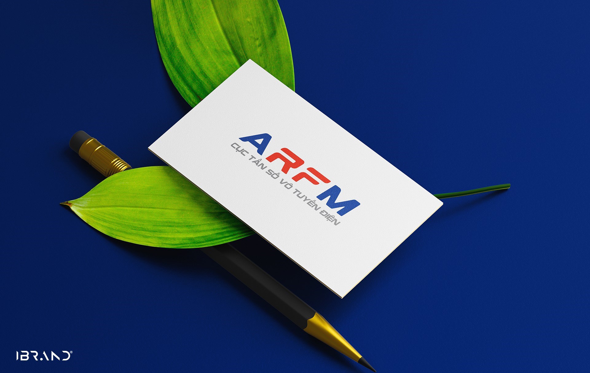
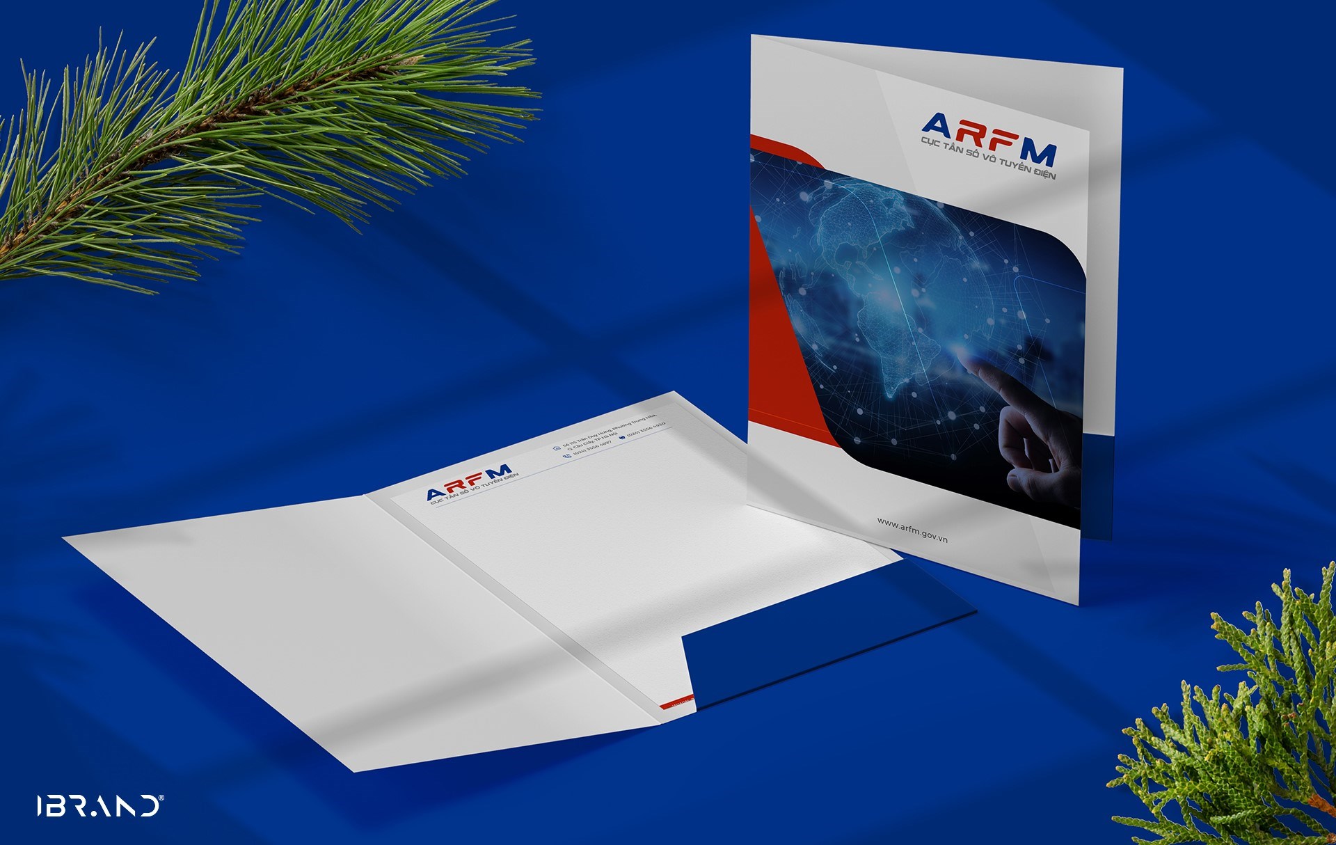
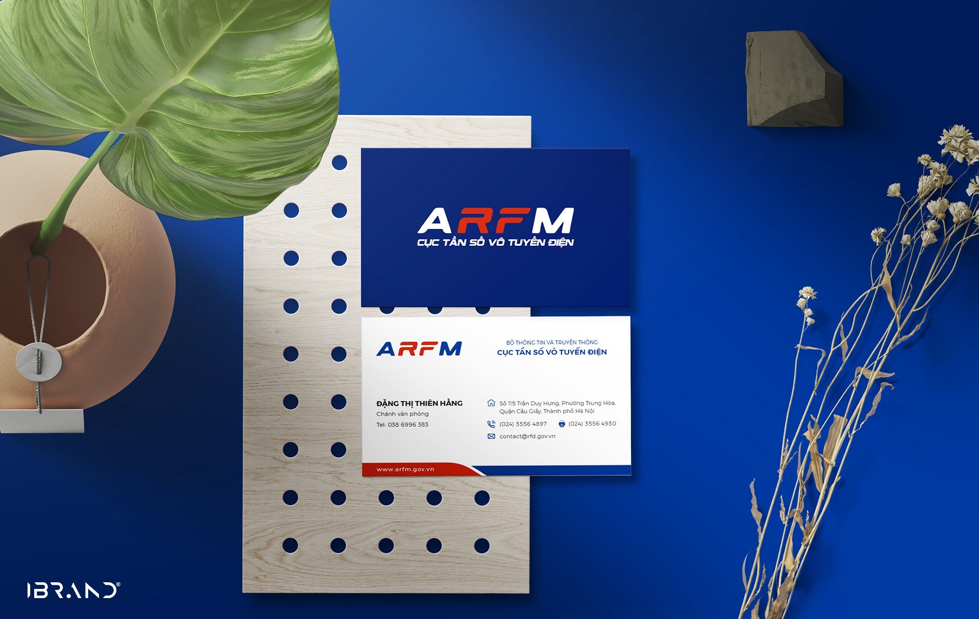
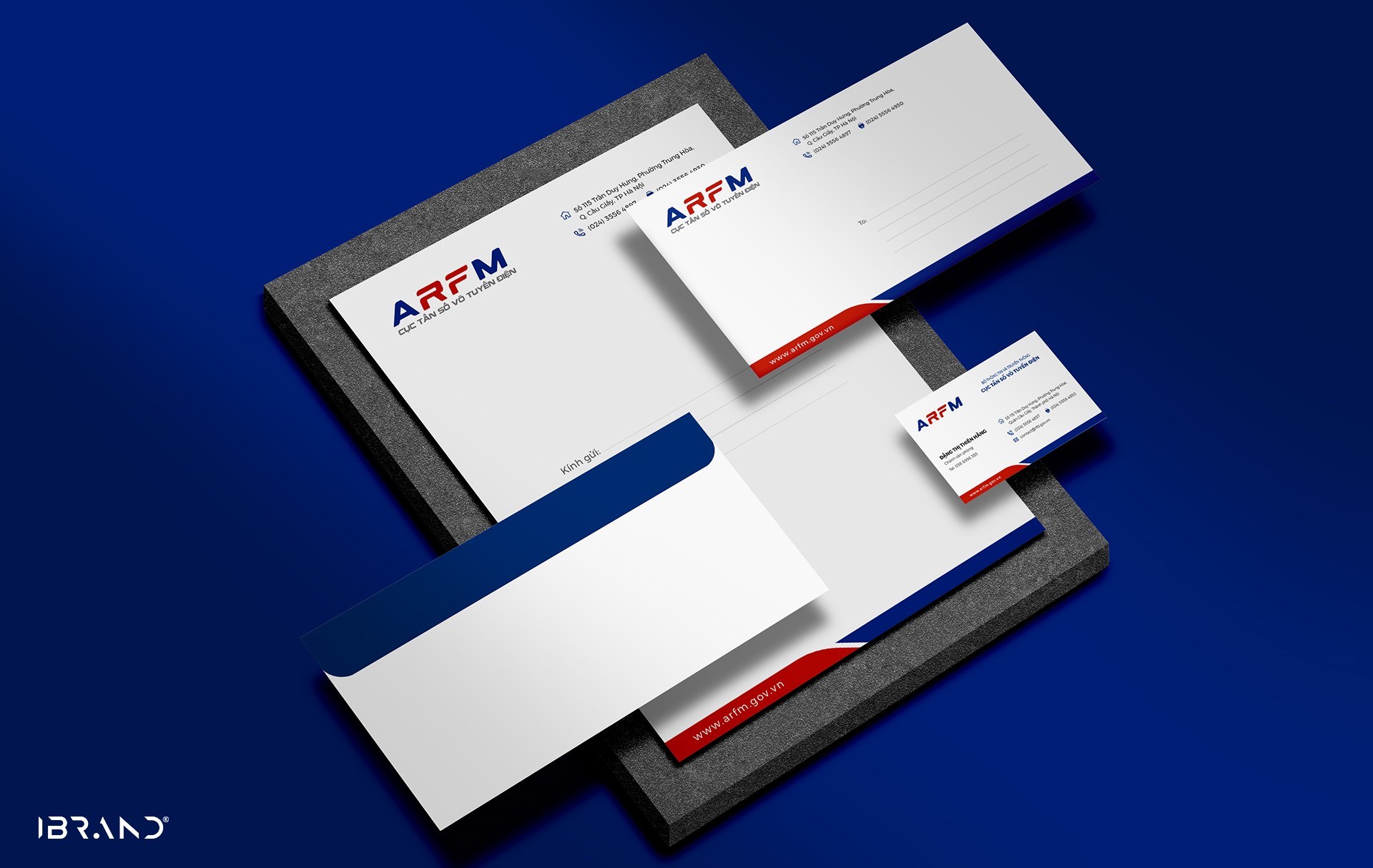
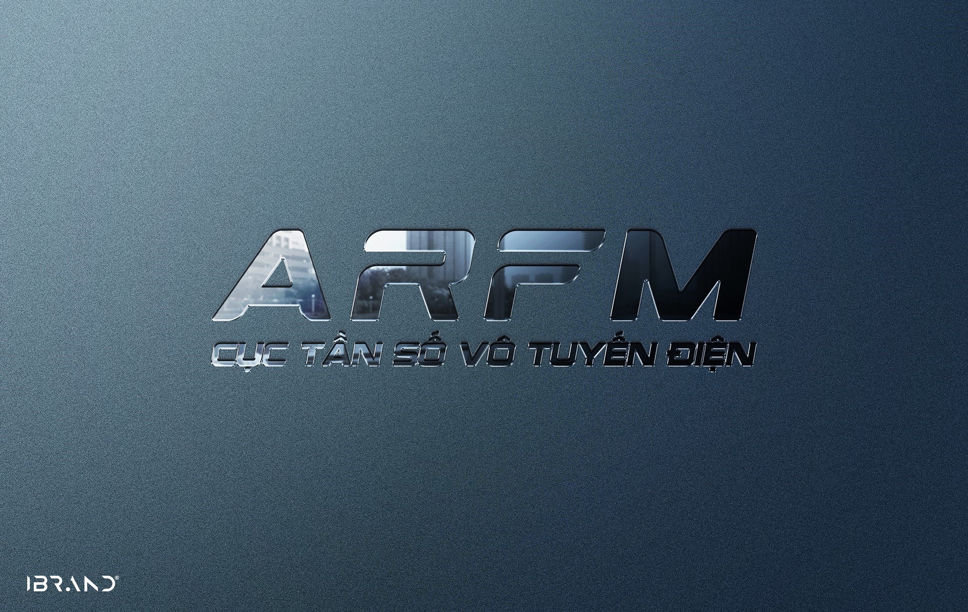
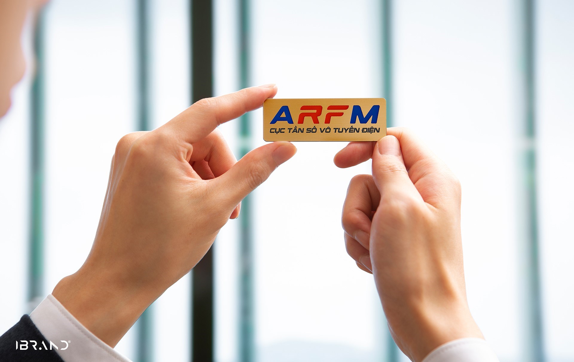
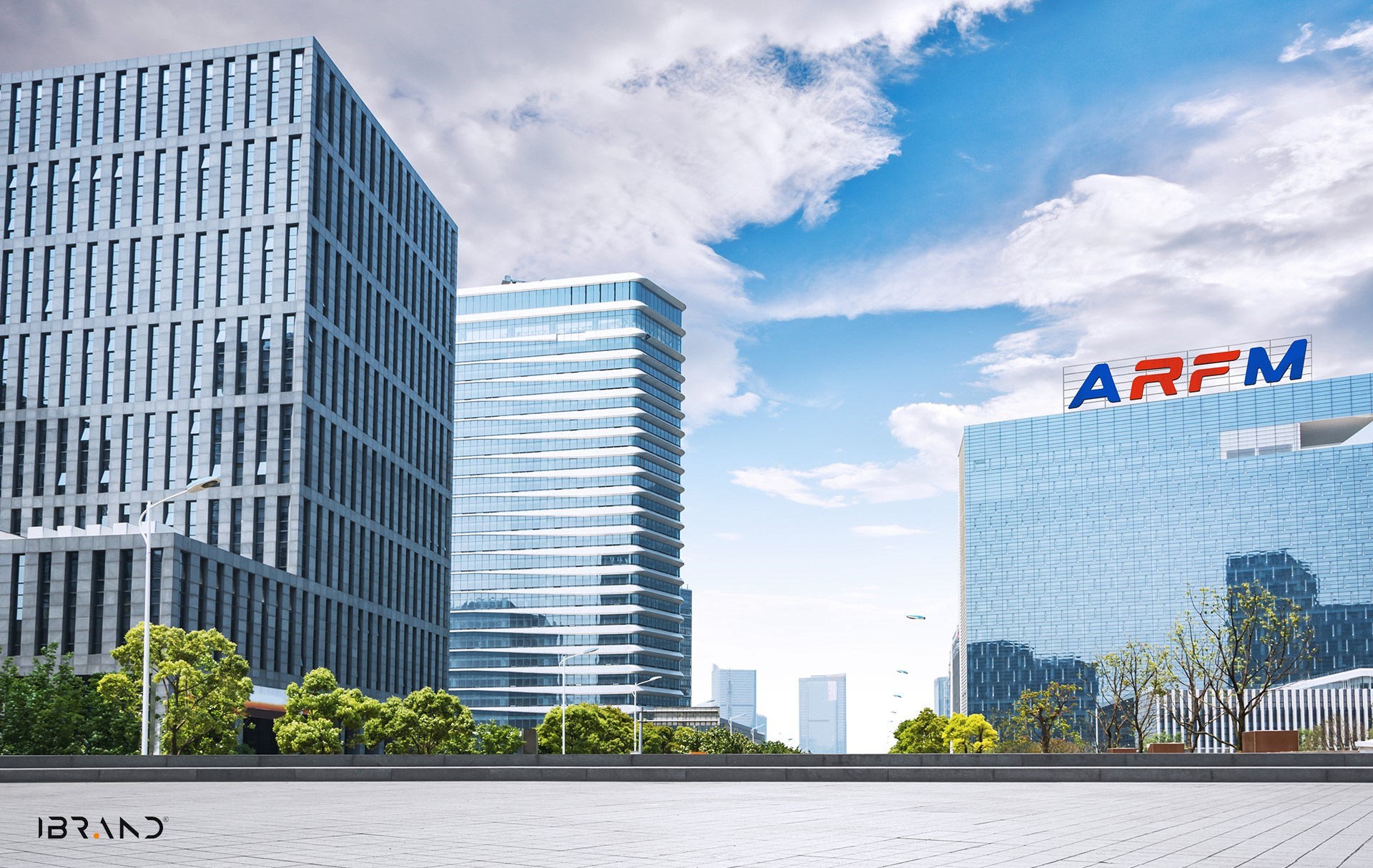
- The Radio Frequency Management Agency logo is taken from the first letters of the unit name “The Authority of Radio Frequency Management”.
The logo is designed in typography style: The art of stylized letters, the letters are cleverly aligned to form a block with close association with each other.
The logo has a solid and modern spirit in line with the nature of technology. The handwriting is clear, easy to read and easy to apply with the highlight of the letter RF in the center, representing the industry of the unit “Radio Frequency”. The logo layout with a left-to-right slant represents the movement of constant development and innovation.
- The logo font uses a modern sans serif format with clear bold strokes to create solidity and prestige.
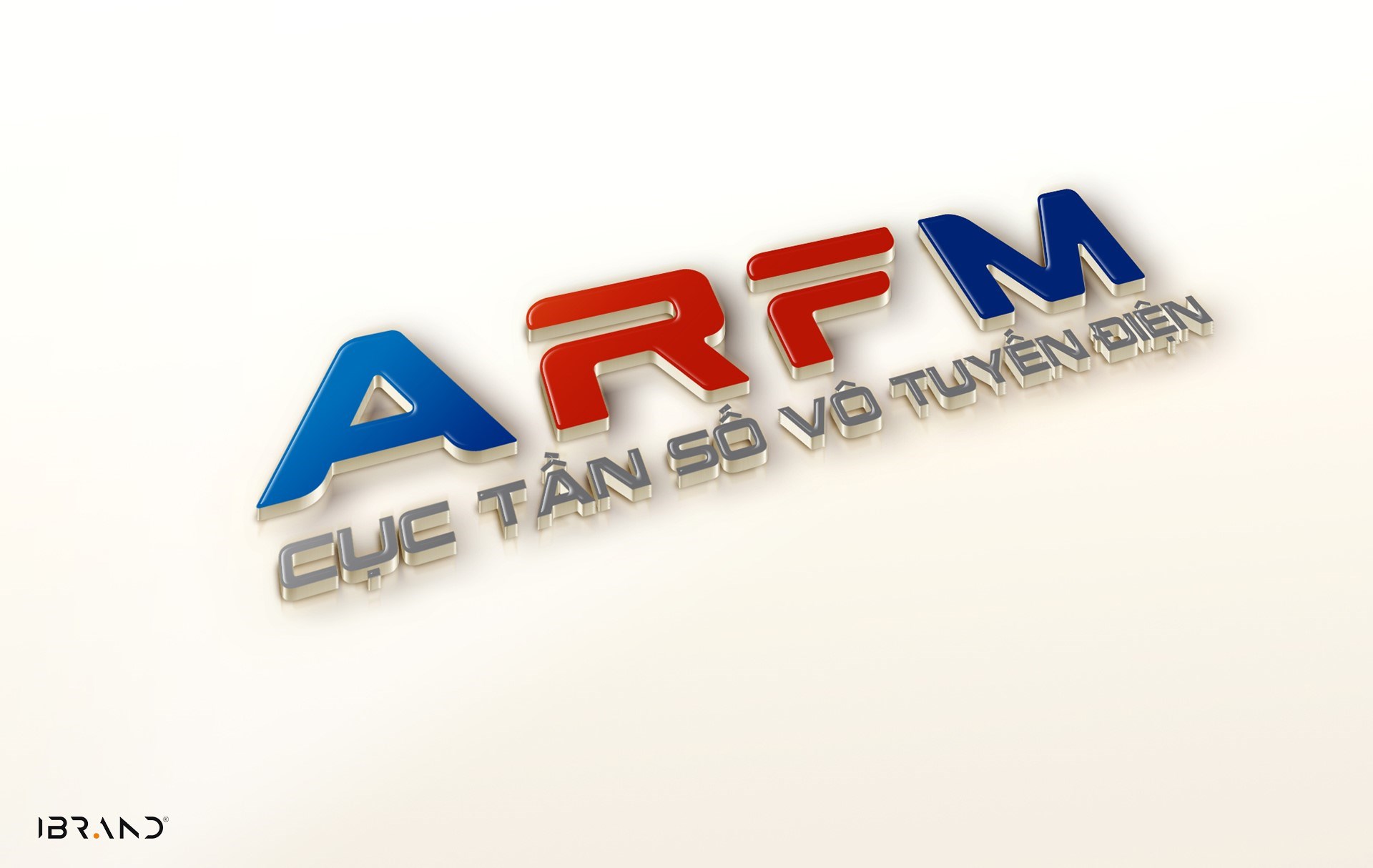
- The logo colors stand out with two main colors:
+ Red: the color of the red flag, showing enthusiasm and enthusiasm at work.
+ Blue color: the typical color of technology shows the professionalism, prestige and creativity of the unit
The color combination is harmonious in terms of meaning, sharp in terms of aesthetics, creating good visual effects.